let's make something together.
terracotta is the only accent. the logo is one mark, the type is two faces, the voice is plain. here's the whole system.
what mutuol is
mutuol is a multi-partner organization. a household that happens to span three offices (denver, amsterdam, zurich). we share infrastructure, finances, domestic operations, and a life together. the brand is handmade, not corporate.
the mark
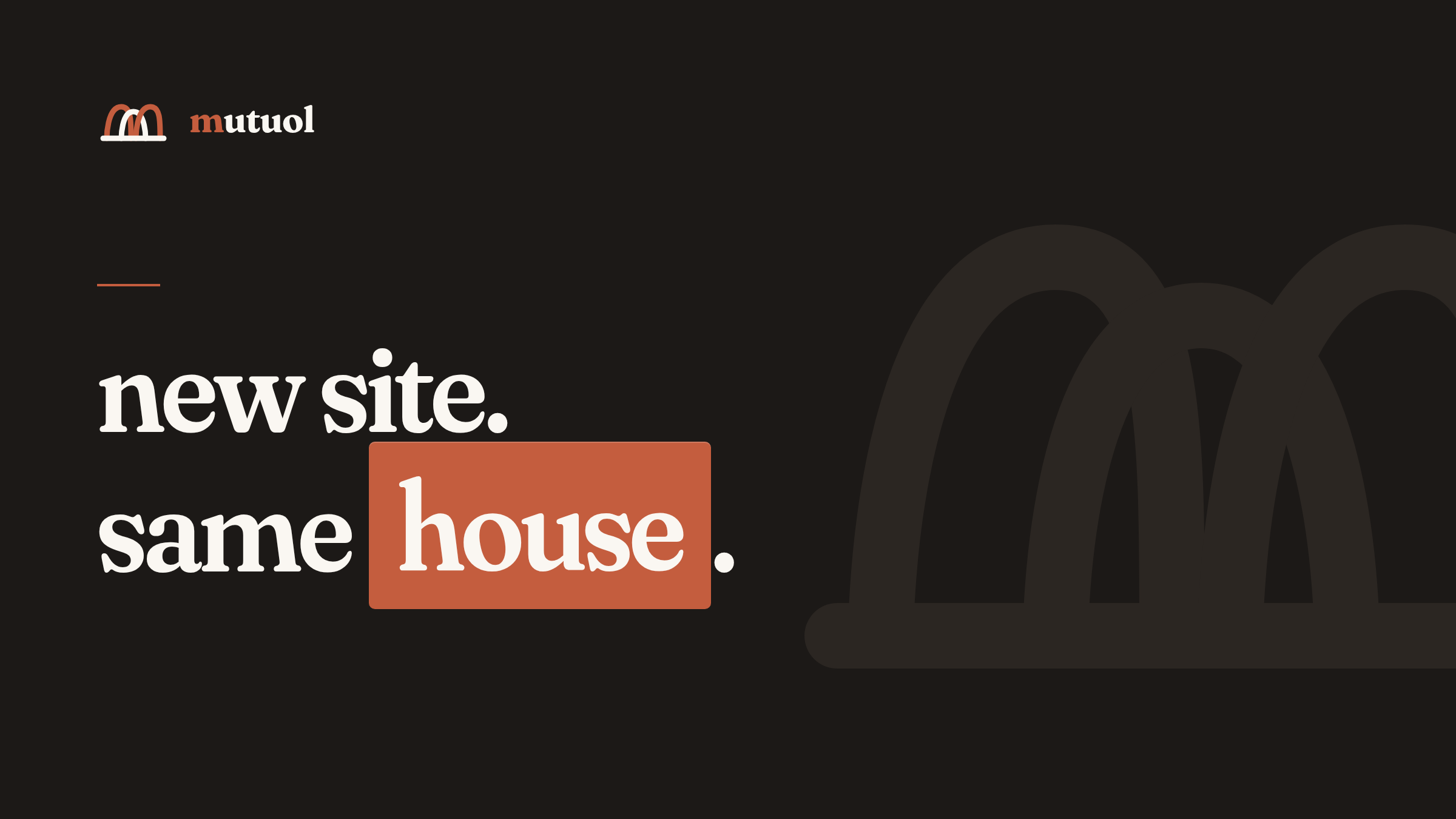
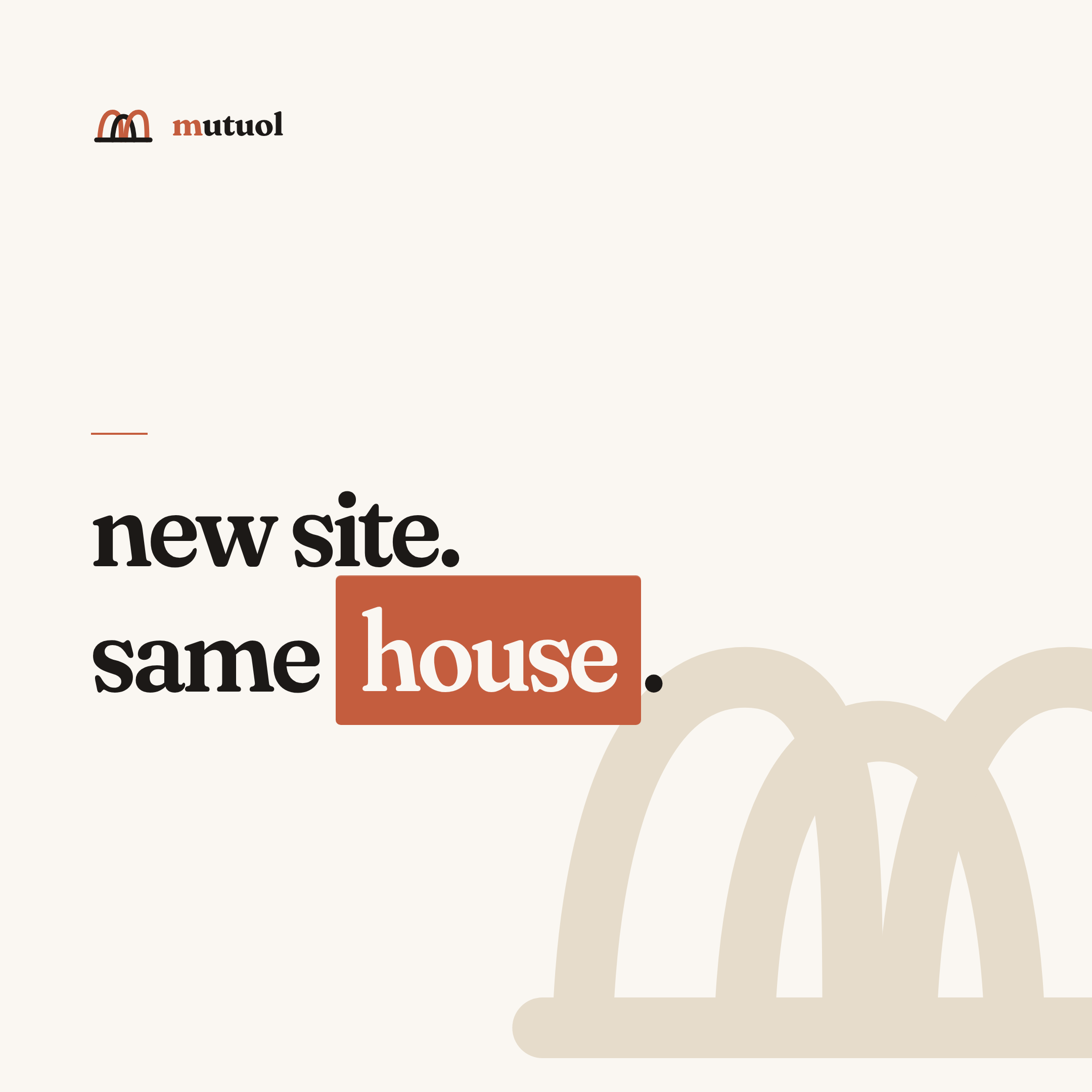
three arches over a baseline, drawn in heavy rounded strokes. the default is color: two arches in terracotta, one in the surface color. a solid white version also works on dark backgrounds. on terracotta grounds, the arches flip: two charcoal, center paper.
the wordmark
"mutuol" set in Fraunces, lowercase, tight tracking. the leading "m" is terracotta; the rest take the surface color (paper on dark, charcoal on light). on terracotta grounds, the leading m is charcoal.
colors
terracotta is the only accent. it's reserved for the logo, UI accents (links, active states, buttons), and soft tints on tags and pills. everything else is paper, sand, charcoal, and grey.
typography
two faces, nothing else. Fraunces for display: headlines, the wordmark, section titles. DM Mono for everything else: body, UI, labels. body copy is set lowercase.
voice
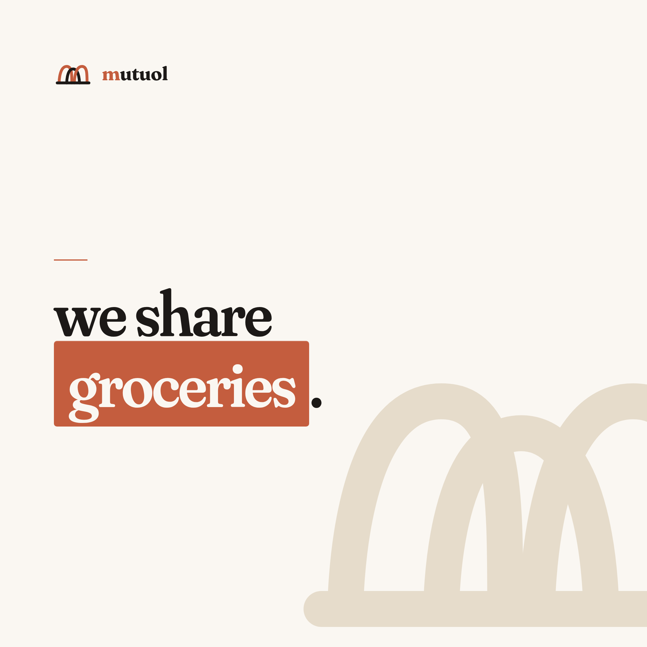
short sentences, lowercase, specifics over adjectives. no marketing fluff, no hedging ("some", "quite", "when practical"), no corporate-speak. say "we share groceries," not "we leverage shared domestic infrastructure." no capitals in running copy. the only caps on this site are acronyms.
if a line could appear unedited on a generic startup's careers page, rewrite it.
social assets
each canvas is a self-contained html file in banner/ with a png export. edit the html, export at the listed size.
avatar · 1000x1000 · mutuol-avatar-1000.png
header · 1500x500 · mutuol-header-1500x500.png
hiring · 1080x1080 · mutuol-hiring-1080.png
og · 1200x630 · mutuol-og-1200x630.png
post · 1200x675 · mutuol-post-1200x675.png
quote · 1080x1080 · mutuol-quote-1080.png
square · 1080x1080 · mutuol-square-1080.png
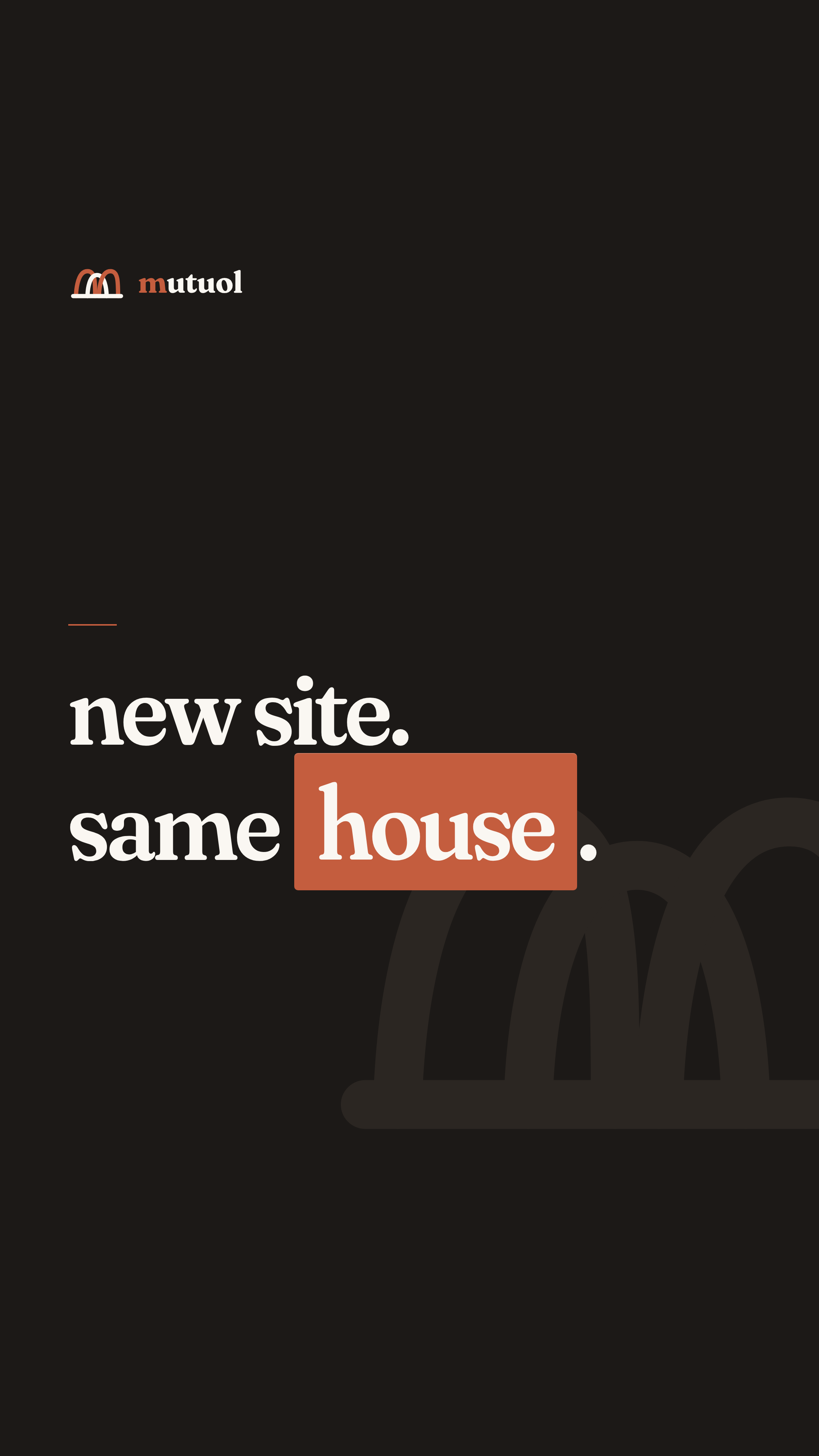
vertical · 1080x1920 · mutuol-vertical-1080x1920.png